

*Contains Story Spoilers for Persona 5*
A user interface, or UI, isn’t what comes to mind when someone thinks “video game.” They’re subtle, and despite how much presence they have in any given title, they always seem to live in the shadow of other features. Things like movement and difficulty feel much more important than the UI, but in truth, the user interface affects every part of a game. It’s the cornerstone of game-to-player communication, and serving that vital role is why the feature has entire jobs dedicated to it. Whether it be Minecraft or Street Fighter, UI is the glue that keeps a game together and a player’s experience with it positive. It may be the most important aspect of video game design, and there are plenty of reasons why.
What is a User Interface, and What Does It Do For A Video Game?
To preface the following contents of this article, it’s first necessary to define a user interface in regards to a video game. There are a plethora of definitions for the concept in the gaming sphere, but in general, a user interface refers to the features within a game responsible for helping players understand and navigate it mechanically (with the exception of an in-game tutorial). Recognizable examples of UI include health bars, pause menus, hotbars, etc. UI allows a video game to communicate information to the player through visual or textual means, helping them avoid frustration because of confusion and improving their experience with the title. It’s a concept that feels like a minute detail, but its impact is anything but.

*This screenshot was taken from IGN’s Youtube Video found at https://www.youtube.com/watch?v=tnulVfHQz60*
Case in point: Electronic Arts’ “EA Sports UFC 3″ relies heavily on UI in the form of meters to explain the state of both fighters on the screen to its players. It has meters for parts of the body like the head and legs to show the amount of damage those areas have recently received, while also displaying a stamina meter to show how many more effective attacks a fighter can make before becoming exhausted. These features are a big help to those playing, seamlessly conveying their situation and that of their opponent’s. Players naturally lean on these meters in gameplay, learning to make decisions based on them, which is why the Legendary difficulty option in career mode can make the title so much more difficult. On Legendary difficulty, players have those precious UI features permanently disabled, forcing them to use nothing more than intuition, experience, and visual cues to understand the state of their fighter and opponent. This is all to say that UI has a massive impact on the way players play and understand a game, so getting it right is vital. What “getting it right” entails, however, is something that differs from product to product.
How Different Games Handle Their User Interface
Video game developers tackle user interfaces in plenty of unique ways, but no matter the method, all game UI falls under the umbrella of one of four classes of UI: Non-diegetic, Diegetic, Spatial, or Meta. To understand how games handle UI, that topic has to be looked at through the lens of how titles utilize those four classes. No one is better than the other, but rather, they all add different elements to a game while still serving as a communication line between player and game. The functionality is the foundation, but development studios have done plenty to get the most out of their user interfaces from there.
Non-diegetic UI
Non-diegetic UI features are elements of a user interface that don’t exist in a game’s story nor that game’s space, according to Micah Bower’s “Level Up: A Guide to Game UI (with Infographic)”. This means that nothing in the game’s world is conscious of these components’ existence, making them solely resources for the player’s benefit during gameplay. This is the category where classic UI components like score counters fall—simple features that convey basic yet vital information to players. Non-diegetic elements aren’t too flashy, but they’re necessary and leave room for some stylish visuals. The aforementioned UFC 3 is a great example of how to use this type of UI well, as its meters are nigh perfect in design. They function just as they should, are small to prevent immersion breaking, and their faded text and red (or green for the blocking meter) coloration make for a sleek aesthetic touch. Those qualities are what make any piece of Non-diegetic UI great. Functional, subdued, and appealing to the eye; that’s what this category of the user interface is when implemented correctly.
Diegetic
Naturally, Diegetic UI elements are the exact inverse of Non-diegetic ones, existing in both a game’s story and space. They’re the most present of the four UI classes, and that grants them the unique quality of adding to immersion, as opposed to taking away from it as most UI elements tend to do (which isn’t necessarily wrong; it’s more of a necessary evil to make a functional video game). On a user interface, Diegetic components are things like physical maps in adventure games or speedometers in the racing genre (these two examples also came from Micah Bower’s article on UI). They’re still subtle features, but their more tangible representation in-game makes it easier for players to engross themselves in the game world. There may be no better example of that effect than one of the most iconic UI elements in all of gaming: Metal Gear Solid’s Codec.
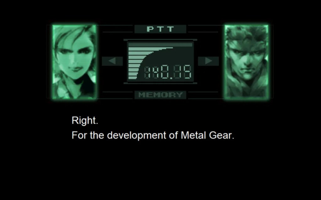
*Image taken from Michael Cripe’s article found at https://www.escapistmagazine.com/metal-gear-solids-codec-calls-peaked-in-the-first-game/*
Existing as both a sort of pause menu and a story element, the Codec makes getting lost in a play session inevitable, with it being ever-present throughout Metal Gear Solid. It makes everything in the title feel a bit more concrete because of its importance as a gameplay and storytelling tool, and that’s what Diegetic UI at large can do when incorporated properly. They’re useful pieces of the user interface that double as a method of creating immersion within a game.
Spatial
Spatial components of a user interface exist in a game’s space but not in the story. They often take the form of visual aids for the player (once again according to Micah Bower’s article), such as text labels or subtitles, helping players garner a general understanding of the things around them and more. Much like Non-diegetic elements, Spatial UI is very simple in concept, and the visual aspects of its presentation are where most of the creativity lies when designing it. The difference between the two is that while Non-diegetic components should be subdued in their visual presentation, Spatial components have to stand out on the screen to effectively convey information to players. Finding that balance of noticeable but not immersion-breaking is difficult, which is why many developers don’t do much with this category of UI, but some have managed to make great use of it.

*Image taken from Reggy’s article found at https://personacentral.com/super-smash-bros-series-creator-discusses-persona-5s-ui/#google_vignette*
Atlus did just that with their hit title Persona 5, a game hailed for having some of the best UI design ever put to the small screen. Its stylized, eye-popping text labels add another level of satisfaction to unlocking chests or performing a successful ambush. Additionally, its striking red and black subtitle boxes entertain while still drawing attention to the contrasting white-colored dialogue. That’s what Spatial UI can do for a title. At its best, components in this category add flare to their titles, producing an extra “wow factor” for players to enjoy.
Meta
Lastly, Meta UI elements exist within a game’s story but not its space. They can be seen in features such as shaking screens in response to damage (as mentioned in Micah Bower’s article on the topic) and are primarily utilized to explain the state of the world or player character. Similarly to Diegetic components, Meta features in a user interface can contribute to immersing a player in a game’s world, but their more “in your face” nature makes them just as likely to remind players that they are playing in a virtual space. However, that doesn’t have to be a bad thing. Meta components assist people in navigating and strategizing precisely because of their noticeability, wordlessly explaining or establishing various situations purely with on-screen effects.

*Image taken from a a Skyrim mod webpage found at https://stepmodifications.org/wiki/Guide:Skyrim_INI/ScreenSplatter*
To see this category of the user interface implemented to perfection, one only needs to turn to The Elder Scrolls V: Skyrim. Skyrim gets away with not always displaying its health bar because of its Meta components, with the title using screen shaking and first-person blood as additional ways to signify damage. These two features give the player constant knowledge about their current health and how powerful certain enemies are, keeping the game understandable in terms of health and damage amounts. Features like that are a microcosm of what Meta UI does best: explaining all the little details of a gameplay state without using a single line of text.
Non-Diegetic, Diegetic, Spatial, and Meta—these four categories of the user interface are as unique as they are similar. All are pipelines for player information, but what they convey and how they convey it differ from category to category. Because of that, game developers take care to handle them in creative ways, and by mixing and matching UI elements in that manner, some of the greatest games ever established foundational aspects of their gameplay.
How The User Interface Lets Gameplay Add to Narratives
The final big thing to note about user interfaces in gaming is how they allow titles to add to their narratives through gameplay. It’s not uncommon to see story-based games use their UI elements to establish a character’s power within the story, create believable feelings of dread, deliver cathartic story beats, etc. By using these gameplay-oriented components for the purpose of storytelling, the line between narrative and gameplay blurs, allowing certain aspects of the story to be highlighted and making it easy to generate emotion in players. Persona 5 is a perfect example of this in action, as its unwinnable boss fight against Caroline and Justine is a masterful instance of incorporating the user interface into the story. This battle takes place near the end of the game and serves as a turning point for the two characters (explaining why dives further into spoiler territory). What’s to note in this battle is how it utilizes the health meter and text labels to instill fear in the player. The twins hammer down on the player character with the strongest attacks Persona 5 contains, all while the player is repeatedly told that they cannot move (essentially meaning they can’t act in retaliation, giving them no way to win the fight). As the player’s health decreases, dread is easily generated due to confusion and fear of losing progress, while the text labels displaying attack names seem to mock them during the hopeless situation. Portraying Caroline and Justine as having this much power makes their realization in the middle of the fight feel like an event that happens independent of the weaker player’s influence, thus maintaining the mysterious nature of the Velvet Room and displaying their underlying positive traits. By using UI elements to finish the character arc of the twins, the story beat naturally falls in line with how the two have been characterized throughout the entire game, keeping the moment genuine in the context of the narrative. The user interface can do that for any narrative; it can enhance characterization and generate raw emotion.
User interfaces are a complex aspect of the gaming industry. For a feature that feels so minor when playing, they can do so much to add to a title. They can affect difficulty, enhance narratives, create immersion, increase graphical quality, etc. UI is as, if not more, important than any game design concept. It’s nothing short of foundational to the design of some of the best titles ever, and understanding it and its categories is a pivotal step in making a masterwork in the medium.
