
*This Article Contains Minor Spoilers for Radiant Black, Radiant Red, The Many Deaths of Laila Starr, Uzumaki, The Sacrificers, Teppu, Giga, and the Energon Universe’s Transformers*
Color is an inextricable part of the world; its ubiquity is represented in all things. Throughout history, it has been a symbol and source of information for all, enriching the human experience in numerous ways. The visual, though, is what comes to mind when one thinks about color; its aesthetic impact is a defining aspect of many mediums. One such medium is that of graphic novels (comics and manga), which rely on color in several ways to tell stories. Decoding the supreme influence that color has on said medium illuminates just how complex graphic novels really are.
Components of Colors
Colors in graphic novels are anything but simple; they have an array of components that go into their illustration. Each aspect comes together to form the many tones readers view, crafting the unique visual style and atmosphere of a work. Pigment, saturation, tints, and value—those are the building blocks of color in the medium. Understanding the effect of those individual pieces is step one to understanding the importance of it as a whole.
Pigment
“Pigments are the coloring material that can be used to apply color to other things. For example, paints and inks are made from suspending pigments in a type of liquid.” – (Color · Considering Comics)
As per that definition, pigments serve as the foundation of colors. They create the elementary effects of whatever hue they’ll become, such as dictating if a red will look violent or romantic to readers. More than that, pigments establish a basic visual identity for their eventual color, whether that be through making it striking or subdued. All impactful colors in a graphic novel are supported by proper pigment choice, paving the way for them to make their mark on the work.
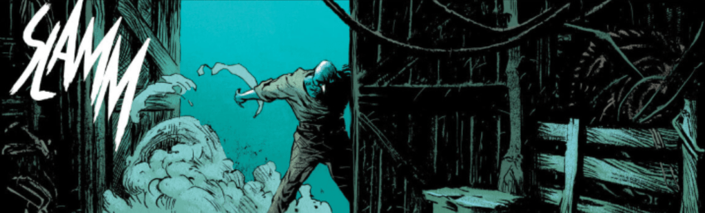
*Image Taken from Issue #1 of The Sacrificers*
For instance, The Sacrificers (by writer Rick Remender and artists Dave McCaig and Max Fiumara) uses the above blue as a sign of impending or arriving tragedy, starting that as early on as its first issue. The color strikingly highlights danger in this panel, as well as many others in the comic, and inserting meaning into it like that is only possible due to the artists’ intelligent choice of pigment. The sky blue is beautiful, eye-catching, and somber all at once—a tone well-suited to serving as a symbol of disaster. Regardless of the spots where it may be darker or lighter, the psychological effect and visual identity of that pigment cannot be misconstrued, allowing the color it creates to elevate the world of The Sacrificers. Truly, that one blue is a microcosm of the influence of pigments. Nuance is effective in illustration, but the basic look and feel a good pigment offers a work is just as powerful.
Saturation
“Saturation describes how vivid the color created by a pigment is.” – (Color · Considering Comics)
Saturation is the determinant of how clear or dull a color is. If the color orange is highly saturated, it’ll look like orange, while it’ll have a grayish look to it with low saturation. Believe it or not, this can be incredibly impactful for the final color, giving it the ability to establish an atmosphere or organically exist within an environment.

*Image Taken from Giga Chapter One*
Giga (written by Alex Paknadel and illustrated by John Lê) features gorgeously-drawn environments, and this is largely due to its great use of saturation. Observe the various yellows and reds present in the above spread, some intense and others dull. The more vivid tones cause landmarks (namely the giant robot) to be effortlessly notable, easily giving the city a sense of scale while duller, earthier hues add realism to the artwork. Through the impact of that intentional saturation, the illustrated city appears grand yet mundane, advanced but dingy. Saturation has that sort of effect, granting a palpable atmosphere to a location while keeping it visually appealing.
Tints and Shades
“Tints are pure colors mixed with white, and shades are pure colors mixed with black.” – (Color · Considering Comics)
Tints and shades are the specifics of colors, the forest greens and the lime greens. Adding some light or dark to a hue yields plenty of literary and visual rewards, as they take whatever the existing color was and layer on new qualities. White inserts some luster or serenity to a tone, while black can weave in grime or fear. Even without words, readers will attribute the additional light or darkness to those things, silently communicating minor details to them. This helps to immerse them in the world of the graphic novel, engrossing them through the complexity of color.

*Image Taken from Chapter 2 of Radiant Red, titled “The Crucible”*
Radiant Red (authored by Cherish Chen and drawn by Miquel Muerto and David Lafuente) is especially fond of using diverse tints and shades. Examining this action panel, it’s easy to see why that is. The varied coloration conveys lots of information, particularly about the attire of the battling characters. The green-suited combatant (Shift) is clearly shown to have technologically advanced gear, as neon green is a science fiction staple, and the out-of-place bright pinks imply phasing. Something that visually informing drags consumers into the experience, while simultaneously throttling the need for exposition regarding the equipment. The red-clad fighter (the titular Radiant Red) conveys a similar amount of physical information, with the bright red highlights on her black suit being astronaut-esque, cluing readers into its cosmic origins. Tints and shades make that wordless exposition possible, allowing for a graphic novel to be more fluid in the writing department and absolutely enthralling visually.
Value
“Value is the relative lightness or darkness of a color. To put it in other words, value is like a sliding scale that describes the ratio of pigment to black or white in a shade or tint.” – (Color · Considering Comics)
Value is almost an extension of shades and tints, detailing how much pigment exists in a color in comparison to the black or white added. That said, the two are different concepts, namely because value is much more black-and-white visually. A high-value color is very close to white, while a lower-value one is almost completely black. In practice, it helps tremendously with giving artwork depth and dimension (a point brought out in Color · Considering Comics), making for artwork that seems truly lifelike. Much like shades or tints, the realism achieved through value immerses consumers and helps establish the vital suspension of disbelief.
*Image Taken from Transformers #1*
The Energon Universe’s Transformers comic series (written by Daniel Warren Johnson and illustrated by Johnson alongside Mike Spicer) utilizes value religiously to give its art the illusion of having three dimensions, and the above panel is a prime example of the reason for that. The dark blue of the spaceship is a solid anchor point for the eyes, while the inclusions of straight blacks and darker blues on the side give the illustration an outward look. The blacks are particularly prominent through the ship’s scratch marks as well, a subtle detail that acts as a false Z-axis for the drawing. Together, these low-value blues and no-value blacks provide the panel with the ability to almost jump out of the page, tricking the mind into seeing genuine dimensions and depth that drawings cannot actually contain. That mental trick gives this panel and the rest of the comic series a realistic edge, transforming the crazy sci-fi world of Transformers into something more authentic and human. Value is capable of visual and literary feats as great as that and more; the realistic designs it crafts ground graphic novels in a more immersive reality.
Whether it be establishing a psychological effect, an atmosphere, conveying information, or inserting realism into a work, the components of color are the reason colors in graphic novels can be that impactful. The four (or fiveish) elements of pigments, saturation, tints and shades, and value build up a color to have all the literary and visual impact a work requires from it, molding it into a powerful narrative tool.
Designs
The appeal of any graphic novel lies in its designs, both environmental and character. Designs entertain, inform, and interest readers visually—that extra entertainment factor makes the narrative of a graphic novel easy to consume. Good design work is thus of the utmost importance in the medium, and good design work requires proper coloration (even in black-and-white manga). Yes, color is the metaphorical glue that holds any comic or manga together, supreme in its influence over quality. Good color usage in designs is key; the positive effects of doing so are innumerable for a work, but spotlighting just some gets the impact of the act across plenty.
Design Coloration in Comics

*Image Taken from Chapter 1 of The Many Deaths of Laila Starr, entitled “Once Upon A Falling Starr”*
“The Many Deaths of Laila Starr” (written by Ram V and drawn by Filipe Andrade) contains consistently great character designs, using every component of color to make its most important figures visually interesting and memorable. The comic’s meticulous coloration is seen most prominently in its protagonist, the titular Laila Starr (shown in the above picture). Just looking at her basic appearance, the colors that make her up hint at elements of her character while also giving her a striking and recognizable look. The brown pigment of Laila’s face is heavily saturated and employs a tint to achieve her tan complexion, highlighting her Indian heritage to authentically establish the setting of the entire comic for readers. The yellow pigment of her jewelry makes use of a high value ratio to appear lustrous and regal, a small way to shed light on her godly nature and help her stand out. Lastly, the lowly saturated, highly shaded, and low-value blue pigment for Laila’s hair completes her design. It’s a striking physical trait that looks as realistic as it does stylized, solidifying Starr herself as a memorable face. Combined, the brown, yellow, and blue color scheme form a design both fantastical and realistic, laying the foundation for Laila’s array of artistically gorgeous appearances, subtly informing consumers of her true godhood, and garnering interest for the character by displaying that information visually. Good coloration makes Laila Starr’s design more entertaining in drawings and more authentic to the character narratively, which is something it can do for any character design. Through the act of using color properly, designs like Starr’s are elevated from great linework to literarily versatile, interesting, and informative marvels of illustration.

*Image Taken from Chapter Ten of Radiant Black, named “Existence”*
Radiant Black (authored by Kyle Higgins and illustrated by Marcelo Costa) is chock-full of gorgeously drawn environments, but none in the comic shines as brightly as the mysterious world inside the Radiants, Existence. The highly saturated, colorful pigments of the realm easily characterize it as otherworldly or ethereal, while the variety of shades present within it enable the location to visually represent emotional story beats taking place within it. Costa made sure not to make the cosmic area overwhelming, however, making use of many low-value pigments for an easy-on-the eyes look that also inserts an element of mystery into Existence. With color alone, this pivotal place in the story is incredibly appealing to the eye—awe-inspiring even. Moreover, color gives the locale function, with its many tones melding together to embody feelings. That’s how it benefits environmental designs; color can give them narrative function and raise them to the level of artistic masterworks.
In the world of comic books, color can heavily impact both environments and characters. When used well, they can sneakily inform readers about elements of those designs, grant them extra functions within the work, and represent key details, and that’s just scratching the surface of their influence. The fact is, the power of color is what makes comic designs excellent, forming a marriage with the linework to produce wonders of illustration. Any aspiring comic book creator would be doing themselves a service to carefully consider them, due to their sway on both a reader’s enjoyment and comprehension of a tale.
Design Coloration in Manga

*Image Taken from Chapter 1 of Uzumaki, titled “The Spiral Obsession”*
Even with the limitations of featuring only monochrome tones, manga designs are still massively impacted by their color usage. Uzumaki (authored and drawn by Junji Ito) is a shining example of the reason for that, as the work takes advantage of several benefits brought on by masterful black-and-white coloration in its character designs. Shuichi Saito (seen in the above panel) is of particular note in that regard, his appearance showing off vital aspects of his character with the palette. Notice his blacked-out hair and the similarly black, thin frown on his face. These physical features wordlessly present his downtrodden and paranoid mental state, a defining trait of his throughout the manga. Furthermore, his ever-present black glasses symbolize his intellect, especially with them being accompanied by a formal school uniform for much of the narrative. These uses of monochrome are simple, yes, but they inform readers about the character in the same way a vibrant blue or red would. The monochrome tones present in Shuichi’s design mirror normal color in other ways too, making him stand out as well as a true color would. Uzumaki is just a singular example, but the point remains: the black-and-white of a manga can inform and entertain the same as a color could in a comic. They’re two sides of the same coin, functioning almost identically to each other.
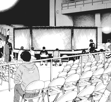
*Image Taken from Teppu Chapter 5, titled “Square, As Square As It Gets”*
Environmental designs feel far from hindered by a manga’s monochrome palette, appearing just as visually intricate and interesting as anything in a colored comic. The realistic environments of Teppu (written and illustrated by Moare Ohta) prove that, awing and immersing readers with their lifelike detail. Consider the above panel; it is able to authentically portray the setting of an MMA match with its monochrome palette. The mass of white chairs draws in the eye, silently portraying the location as belonging to an event, which is a hint only reinforced by the hyperrealistic octagon. Its thin, gray linework combines with the striking gaps of white to perfectly represent a cage being photographed, while the creased, jet black corners offer the illustration an appealing finish. As Joshua Greenberg brings out in Balloon & Panel: Colors in comics establish themes, alter perception, “The strongest tool in a monochrome comic’s arsenal is the ability to show really stark contrasts between the blacks and whites.” and this is exactly what Ohta does in the panel, as well as many others in Teppu. He uses blacks, whites, and everything in between to make components of a locale stand out, making for gorgeous environments that lack notable clutter. Manga’s monochrome can do that for any design, perhaps even better than a comic’s color can; its simplicity ensures no details of an area are lost in an abundance of pigments. In place of function, the black-and-white environmental designs provide readers with very understandable and consumable artwork, raising the accessibility of manga as a whole.
Coloration in designs can mix informativeness, functionality, setting establishment, uniqueness, artistic detail, readability, and more into the look of graphic novels, all while keeping the medium visually stunning. Its impact touches every aspect of designs; proper usage transforms superb linework into gorgeous artwork, regardless of the way it is utilized. No design in the medium is complete without the support of intentional color usage, whether that be through a colorful or monochromatic palette, and the importance of said act stems from its countless positive effects.
Emotional Impact
It’s no secret that colors affect the emotional state of those viewing them, and as has been stated here and there throughout this article, graphic novels have plenty of reasons to take advantage of that. Using color to generate and maintain select emotions over the course of a chapter or narrative improves the quality of any work in the medium, helping to engross readers in a story while making said story more thematically rich and meaningful. Joshua Greenberg says as much in Balloon & Panel: Colors in comics establish themes, alter perception, where he states, “Color in comics has the ability to heighten reality, making everything from the characters to the plot look and feel in a way that accentuates the ideas.” Additionally, the emotional impact of color is another way color informs audiences, as it can clearly convey a character’s emotion in a “show, don’t tell” form.
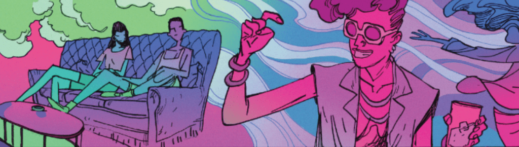
*Image Taken from Chapter 3 of The Many Deaths of Laila Starr, titled “Up In Smoke”*
Once again, “The Many Deaths of Laila Starr” is a perfect example of color’s influence in practice, as its usage of color to craft emotional impact is nothing short of ingenious. Taking a look at the above panel, the contrast of cooler and warmer saturated tones gives the artwork an emotionally evocative feel, showing off another effect of coloration. The flood of vibrant, larger-than-life pink gives the artwork a sense of joy and energy, emotions intentionally undermined by the equally vibrant blues and purples present. These cooler colors create a juxtaposition with the warmer pink, being more striking due to the contrast and generating a feeling of hollow happiness to start the chapter. The characters depicted in blue and purple, particularly Laila Starr, accentuate the hollowness, while the ones in pink do the same for happiness. It’s a poignant manner of colorization that immerses readers with emotional intricacy while informing them of Starr’s melancholic mental state during Chapter 3, both factors contributing to the moments to follow being as powerful as they are. The emotional impact of color can do that much and more for any story in the graphic novel medium. It can immerse readers, make story beats more memorable, portray emotions without unnatural exposition, etc. No matter the genre or art style, utilizing the emotional impact of color is a boon.
To summarize, color is a universally impactful aspect of graphic novels. The components that make up any given tone have a plethora of effects on it, allowing for the creation of shadows, depth, scale, and relevant emotional responses. Once finalized, those colors go on to be a defining aspect of designs in the medium, enabling settings to be established, traits to be hinted at, functions to be given to certain places, and more. Lastly, the emotional impact of color factors into making those designs, and general backgrounds for a graphic novel. interesting and evocative, engrossing and informing readers via their feelings. There is no part of the medium color doesn’t touch. To make a great graphic novel is to use color intentionally and properly, and by doing so, some of the greatest stories ever told have been crafted.

2 responses to “Color in Graphic Novels: Aspects of Design”
Color is for nerds, be like me and drink black ink.
LikeLike
[…] making the design very realistic. Speaking of, the realism of Darius’ skin tone (more on color in our article on the topic) and facial expression is artistically genius, easily immersing readers into the panel as if it […]
LikeLike